Development
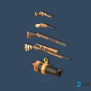
This is the Asset list for my game
Here you can find the Production Log for my game
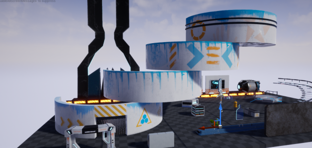
This is the final look of my map, and a Development board that we printed professionally.

Evaluation
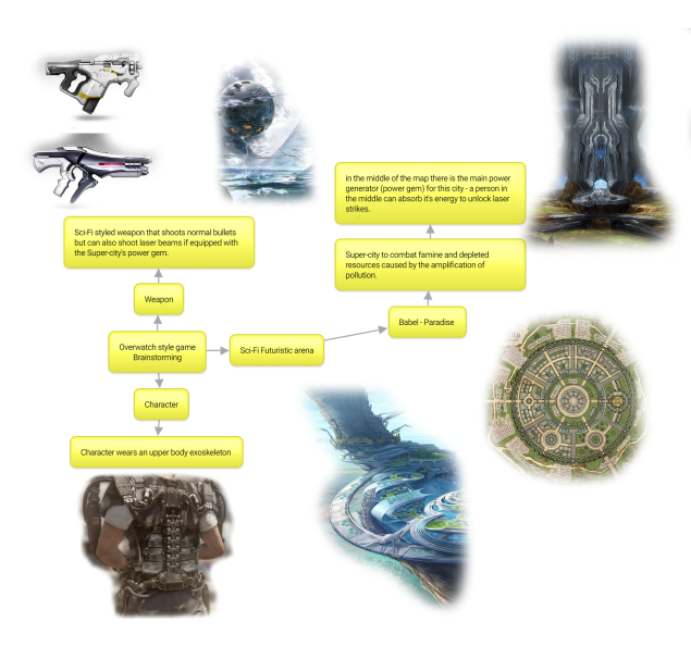
My original map design was a supercity based in 2065. Babel is the only habitable place on planet Earth after the rest of the world was wiped by famine and depleted resources, caused by extreme pollution. Since it’s the only “active” place on Earth, it gets its energy from the PowerGem – a small stone found in the middle of the map. This stone was stolen by the government, that is using it mostly to their advantage for nuclear weapons, and not providing electricity to the rest of the inhabitants of the city. Because of this, people are furious, fighting over a stone just for a pinch of energy. It is your job as a military soldier to take this stone and put it in the the right hands, providing energy for everyone.
The feedback I got was mainly positive. Everyone liked the feel of the game and how it looked accurately futuristic, despite it not fitting in the Overwatch style. The size of the map was good, not too big to lose yourself in, and not to small; perfect for free for all matches (as the map was intended for).
The main negative feedback was that the graphics did not match the Overwatch style. This was totally my fault, but I could easily fix this by hand painting cartoon like textures in Photoshop instead of using Substance Painter, which used physically accurate shading.
I was able to complete my assets list by the deadline given. This is mostly because I planned ahead and set specific deadlines to complete individual tasks. Being organised with my work helped a lot.
During the modelling process, I had a problem with the stairs collision where the player would get stuck on a step because it was too high. I fixed this by making a custom collision mesh, which looked like a smooth ramp with no steps, that I used instead of the stairs collision.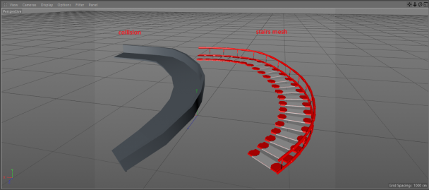
I also ran into a problem in UE4 with the light map for my outer walls. Since the walls had two sides, the maps would collide and create weird shadows. Since you couldn’t see the walls from the outside, I fixed this problem by deleting one side of the walls and making sure that “two sided material” was ticked in the wall material. I made sure to do this last step to retain shadows, if not the sky would act like one side of the wall is missing and wouldn’t cast a shadow.

 This is the difference between sigle-sided and two-sided materials.
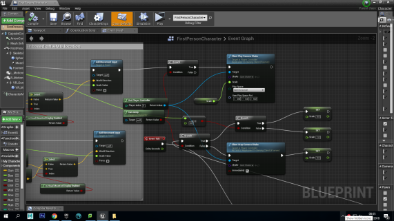
The final problem I found was that the shootable targets, that were part of the interactivity of the level, would spawn on top of each other. I would fix this by first, in the spawner BP adding a boolean variable named “isAvailable” (and make sure it is ticked by default) which would tell the target if the spawner is available to show a target mesh. In the Target BP I would then set “isAvailable” to ticked when the target is destroyed, making it available again.
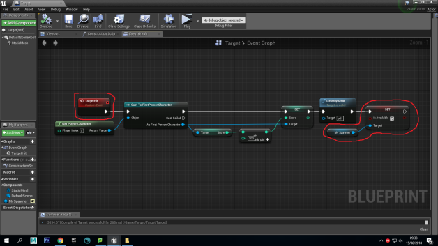 The part in the code that is missing, which would fix this problem, is setting the “isAvailable” variable to un-ticked when the target spawns in the level, making that specific spawner unavailable.
To fix this I added two functions in the level blueprint. One that found available spawners and the other that would get set spawner.

 After this I added the following code, which would find available spawners every two seconds, spawn a target and set the target to not available.

This fix was a bit of a headache, as coding is not my strong point, but with help I managed to correct it in the end.
Thinking about how I could improve for next time, I would definitely make smaller resolution textures, since some of mine were unnecessarily high detailed, which is great for a 3D photo-realistic still or product shot, but not in a video game map where the player will most likely not stand still and admire the detail of a small gas canister. This would also benefit running speeds, as smaller resolution textures will save up processing power.
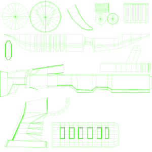
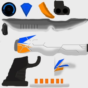
The main reason why I think i was able to create my whole map exactly like I wanted, with little to no problems, is modularity. Before even attempting to model a single asset, I planned and made an asset list where all the assets were broken down into modular parts. For example, for the main circular building I modeled the ground floor piece and middle piece but in halves, so I could easily hand paint textures on the inside of the sections too, cause of course you can walk into the building.
 This made the final process a lot easier, since I just duplicated a single piece a few times and re-positioned them to create a high tower.
Taking a brief overview and test of the level I can safely say that all of my assets show up properly with their according textures, the 3D normals all face the right way (there are no parts where on a model the normals are inverted, and therefore a hole appears in it).
The animations work well and are smooth. There is only a small bug where the player’s “camera bob” when walking, to simulate a slight camera shake, doesn’t stop sometimes, when the key is released, despite it being expressed in the PlayerBP’s code.
The sound also works perfectly fine and is in sync with the animations (the gun shooting sound matches the weapon animation, and the footsteps match the character’s camera bobbing).
Regarding the HUD, everything is displayed correctly, the scoring system works well, and the instructions that appear on screen are displayed for long enough. Part of my feedback for my game was about how the HUD was a bit intrusive when staying still, but when actually playing the game it seemed like the player was wearing a mask/goggles (this is the result I was aiming for) and was not intrusive whatsoever.
 People said, because it was so subtle, it seemed like it disappeared in a way when you were moving around and concentrating on shooting targets.
The feel of the game is right and it is overall fun to play, despite it not matching the style of Overwatch, and matching more Call Of Duty’s graphic style.
Overall, the audience liked my level, finding it particularly realistic and having decently fun interactivity to play with. If we had more time to develop this level , along with other maps, to work with multiple players at once, my map would have been pretty good for free-for-all matches.
For the future, I would definitely develop a real, working loading screen instead of an image in a HUD that loads before the level for an aesthetic purpose, but does not actually load anything.
 I added mine in the level because it made the whole project look more professional, even though it did prevent the player from playing the game for 8 seconds, which is like a waiter handing a steak to a customer, but waiting 8 seconds before allowing them to eat it. It also was used to give a brief introduction / backstory to the map so you knew what you had to do as soon as you spawned, instead of waiting and figuring it out on your own.
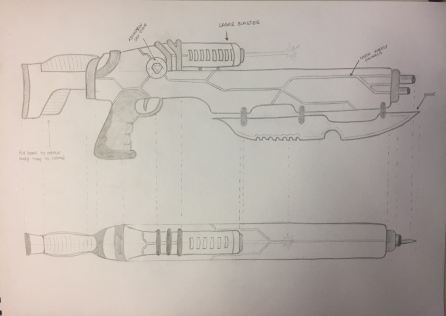


 When animating I looked at a couple of guns from the game Overwatch for reference to the firing speed and recoil speed / amount. This made it easier to keyframe. The rest of the process was adding keyframes to the timeline (by pressing “s”) and moving them along by trial and error, getting the whole animation to play out smoothly.


 After re-positioning the gun in the viewport to a desired look, this was the final result.
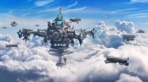
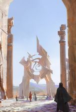
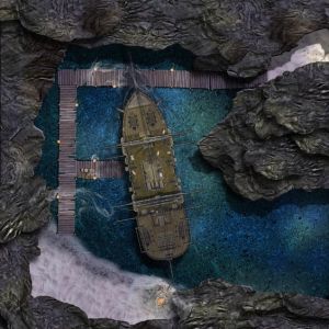
 I came up with 3 different ideas:


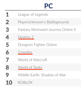
 From the research I made I can see that PC, Smartphones and PS4 are the main platforms used to develop games for in 2017. Although VR and Xbox are really close, I would plan on releasing my game for PC or Mobile.
 This list shows the top grossing games for PC in 2017 (three of which are FPS)